Joos
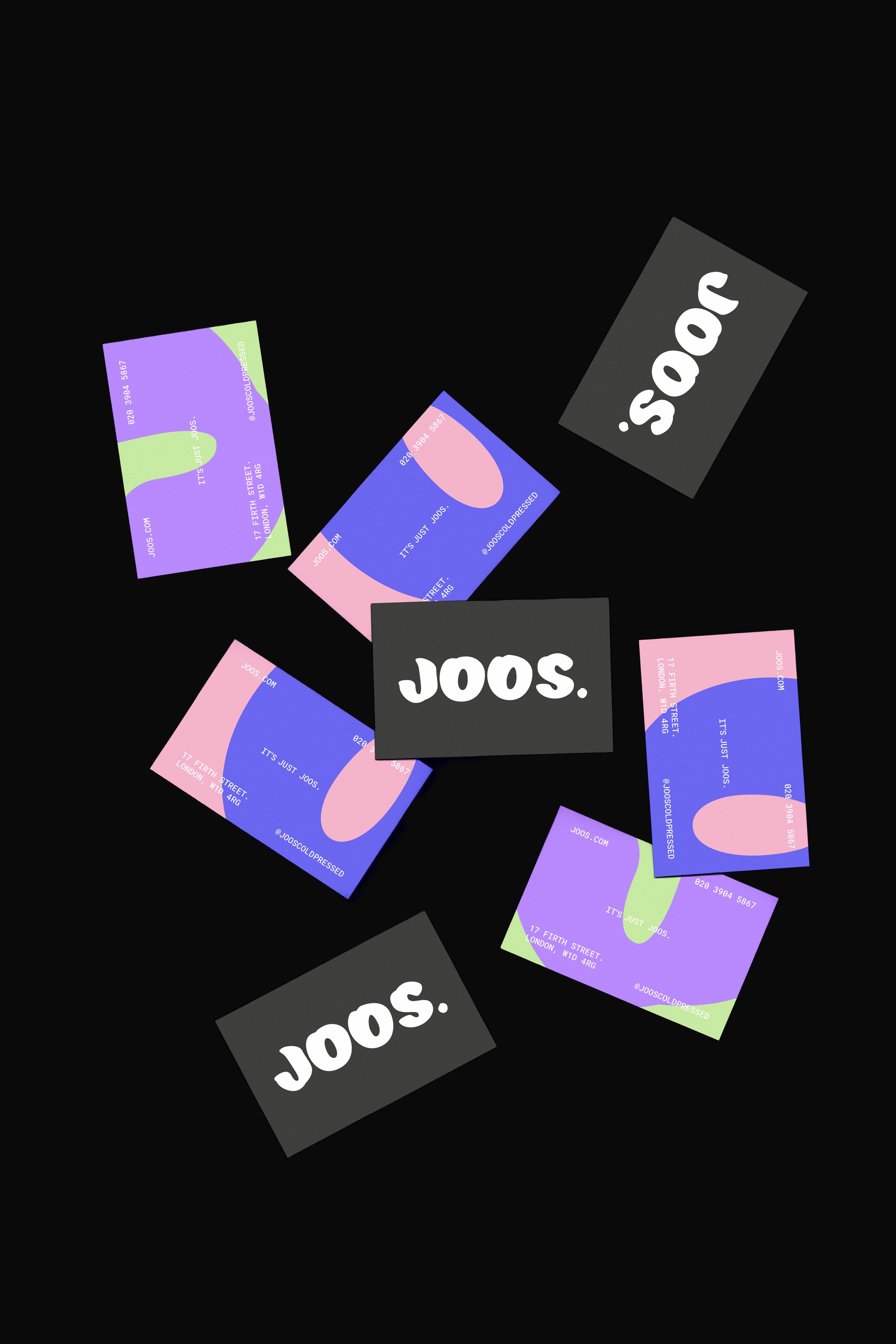
Joos is disrupting the health food scene by doing absolutely nothing. They are cold pressed juice–nothing more, nothing less. In an industry full of false promises Joos is refreshingly honest. The identity designed consists of a bold, succulent logo mark and on the surface, monochrome colour scheme. This is balanced by vibrant patterns, created using the letters at a large scale to resemble juice spills and also hint at the variety of flavours; adding playful energy to the simple visual identity. Mirroring Joos’ ethos–straightforward in its promise but full of flavour beneath the surface.
Branding / Logo Design / Packaging


